One Page, Real Results: Building My Site on Carrd

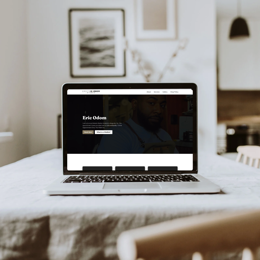
When I decided to rebuild my website, I wanted something fast, minimal, and effective, not another bloated theme buried in plugins. My goal was simple: create a single, clean page that captured everything people needed to know and made it effortless to book an appointment.
I built it entirely on Carrd, enhanced it with custom code, Elfsight widgets, and an embedded Square booking system. The result wasn’t just a polished web presence, it helped me earn a Top 5 Barbershop in Augusta (2025) award from BusinessRate, driven by visibility, reviews, and solid SEO.
Why I Chose Carrd
Carrd offered the exact mix I wanted: speed, simplicity, and full creative control.
No CMS clutter, no database to maintain — just pure focus on layout and usability.
I structured it like this:
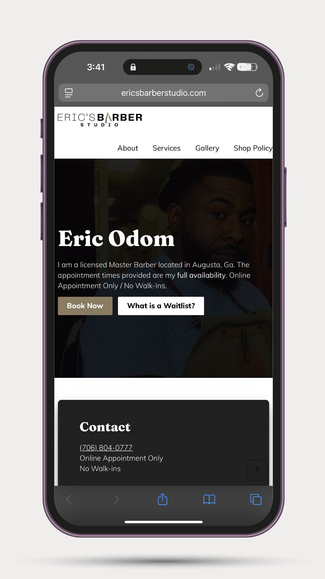
- Hero section: Name, headline, and one bold Book Now button.
- Reviews: Pulled in from Google via Elfsight for social proof.
- Gallery: Live Instagram feed embedded with Elfsight’s IG widget.
- FAQ: Quick answers using another Elfsight block.
- Booking: Square scheduling embed that lets clients book directly.
- Footer: Contact info, social links, and copyright.
Each section scrolls smoothly and loads instantly, perfect for mobile, where most traffic comes from.
Elfsight Integration
Elfsight turned Carrd into something far beyond a static page.
- Reviews Widget: Synced my Google reviews to display verified feedback.
- Instagram Gallery: Auto-pulls recent posts so the page always feels fresh.
- FAQ Widget: Keeps answers structured without extra coding.
I dropped each widget’s embed code into Carrd’s Embed Element, adjusted widths, and used light CSS to match my color palette.
Square Booking Setup
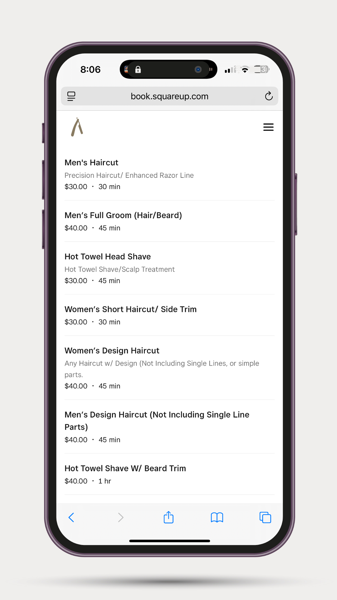
Square makes scheduling frictionless — clients stay on the same page the whole time.
Inside Square:
→ Online Booking → Website Embed → Copy iframe code
Inside Carrd:
→ Add Embed → Paste iframe → Label section “Booking”
Then I added a sticky “Book Now” button that scrolls directly to that section:
.sticky-book {
  position: fixed; right:16px; bottom:16px;
  padding:12px 18px; border-radius:8px;
  background:#000; color:#fff; font-weight:700;
  text-decoration:none; z-index:9999;
}
.sticky-book:hover { background:#333; }
</style>
<a href="#booking" class="sticky-book">Book Now</a>
Now every visitor always has a booking CTA within reach.
Custom Code Enhancements
To keep it looking sharp and loading fast, I added small tweaks under Settings → Code → Footer:
:root { --brand:#111; --muted:#666; }
body { -webkit-font-smoothing:antialiased; }
h1,h2 { letter-spacing:-0.02em; }
.section { padding:64px 0; }
@media (max-width:600px){ .section { padding:44px 0; } }
a { text-decoration:none; }
</style>
This tightened spacing, improved readability, and made the site feel more professional on every device.
SEO & Schema Setup
Even one-page sites can rank well when structured right.
On-page basics:
- Title tag: Eric Odom — Barber Studio in Augusta, GA | Book Online
- Meta description: Book online with Eric’s Barber Studio in Augusta, GA. Verified reviews, gallery, and easy booking.
- Clean heading hierarchy (one H1, logical H2s).
- Descriptive alt text for every image.
LocalBusiness Schema:
<a href="#booki<script type="application/ld+json">
{
  "@context":"https://schema.org",
  "@type":"LocalBusiness",
  "name":"Eric’s Barber Studio",
  "url":"https://yourexampledomain.com",
  "address":{"@type":"PostalAddress","addressLocality":"Augusta","addressRegion":"GA"},
  "priceRange":"$$",
  "sameAs":["https://www.instagram.com/yourhandle","https://g.page/yourgoogleprofile"],
  "areaServed":"Augusta, GA"
}
</script>ng" class="sticky-book">Book Now</a>
That structured data helped search engines confirm who I am, what I do, and where I’m located.
What Happened Next
Once the site went live, bookings increased almost immediately.
Clients said it was easier to use than anything I’d had before. My Google reviews continued to grow through Elfsight, and search visibility improved. Within months, BusinessRate named Eric’s Barber Studio one of the Top 5 Barbershops in Augusta (2025).
It all started from a one-page site that loads in under a second.
What I’d Improve Next
- Add structured FAQ schema for richer Google results.
- A/B-test the hero copy and button color.
- Add analytics tracking for section clicks and conversions.
Closing Thoughts
This project reminded me that simplicity wins.
You don’t need a giant site, you just need one that’s clear, fast, and focused on the action that matters most.
If you’re curious about small, practical builds like this or want to see what I’m working on next, subscribe below. Every post goes straight to your inbox, no fluff, no algorithms, just real work and what I learn along the way.